Case Study: Nest
Nest is a digital platform created to support people who’ve recently moved — not with logistics, but with the emotional journey of settling in.
While most relocation tools help you pack and plan, Nest focuses on what happens after the move: the loneliness, uncertainty, and loss of routines. It gently encourages users to explore their new surroundings, create meaningful rituals, and feel emotionally grounded — helping them build a life, not just a location.
Role: UX/UI Designer (solo)
Tools: Figma, FigJam, Milanote, Google Docs
Duration: 6 weeks
Focus: End-to-end UX — Research, Synthesis, Ideation, UI, Prototyping, Testing
Relocating is often framed as an exciting new chapter. But what happens once the boxes are unpacked?
From personal experience and early conversations with users, I noticed a gap. The tools that exist focus heavily on moving checklists and logistics. But few address the emotional aftermath: building new routines, connecting with a new city, or overcoming feelings of isolation. So I set out to explore:
How might we help people feel at home in a new place, faster – emotionally and practically?

Research & Discovery
Before jumping into design, I needed to understand what really makes moving to a new place feel challenging — not just practically, but emotionally too. To do this, I used a mix of research methods to uncover real user needs and spot opportunities where current tools fall short.
Secondary Research
I began by exploring studies, trend articles, and online discussions around relocation. This helped me ground the project in a broader context.
Key takeaways:
Most tools focus on logistical support (e.g. packing, housing, moving checklists).
There's a clear lack of emotional or social guidance for the move.
Trends like remote work and urban loneliness highlight growing emotional challenges for young adults who relocate.
While some community platforms exist, they often aren’t tailored to newcomers' emotional needs.
Competitive Analysis
Initially, I examined a wide range of tools — from checklist apps to neighborhood platforms. But once I started hearing from real users, I realized the true challenge isn’t moving — it’s settling in.
So I refined my competitive focus and analyzed platforms that aim to support local connection, including:
While these tools help with events or places, none support the personal journey of building routines, reflecting on experiences, or forming emotional anchors in a new environment.
Qualitative interviews
To dive deeper, I conducted 6 qualitative interviews with participants aged 25–55, all of whom had recently moved — both within their countries and internationally. The goal was to gather real-life stories that would validate my hypothesis and shape the product direction.
The interviews were open-ended and designed to feel conversational, covering questions like:
Multiple patterns emerged throughout the interviews:
Most didn’t struggle with the physical move, but felt lost afterward.
There was a strong desire for routine and emotional grounding, yet few tools offered support for that phase.
There is a need for clear guidance , especially for people that moved abroad
Key insight:
The hardest part of moving isn’t the move itself, but settling in emotionally, socially, and practically.
Synthesizing Findings: Affinity Mapping
To make sense of the interviews, I created an affinity map, organizing all responses into emerging themes. This process helped me visualize where emotional needs were concentrated. The insights naturally grouped into six areas
Final takeaway:
The biggest challenge isn’t moving — it’s integrating.
People want to feel grounded, connected, and seen — but most platforms don’t support that part of the journey.
Defining the Opportunity
The insights I gathered painted a consistent picture: the real challenge isn’t the move — it’s integration.
From that, I crafted a Point of View statement to guide ideation:
“I want to help newcomers build rituals, routines, and emotional anchors — because starting over without them can feel overwhelming and lonely.”
To structure brainstorming and align my ideas with user needs, I created How Might We (HMW) questions:
How might we help people turn unfamiliar places into comforting routines?
How might we support reflection and personal growth through shared experiences?
How might we make exploring a new city feel less intimidating and more joyful?
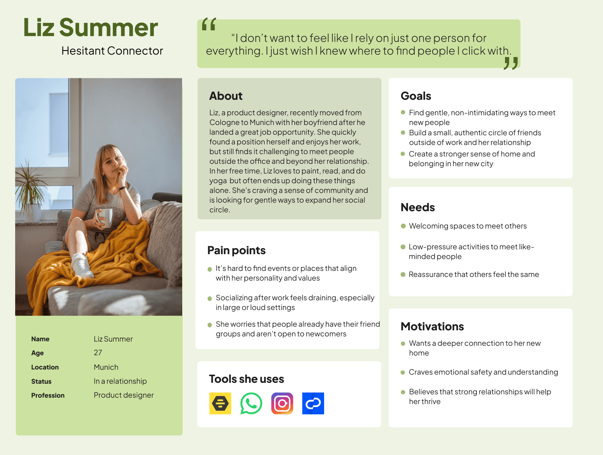
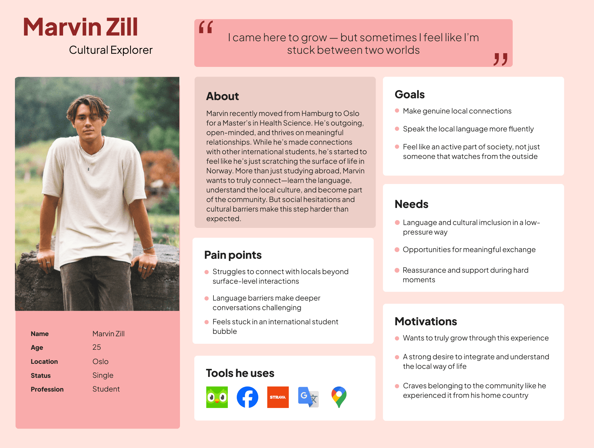
Introducing the Persona
To bring the research insights to life, I created three personas representing different types of people who recently relocated. While all were considered throughout the process, one persona served as the primary focus — a young adult navigating the emotional and practical challenges of starting fresh in a new city.
These personas became crucial reference points throughout the design process, ensuring I stayed grounded in real user motivations and challenges as I moved into ideation and prototyping.
Shaping the idea
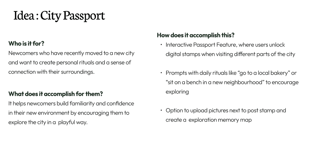
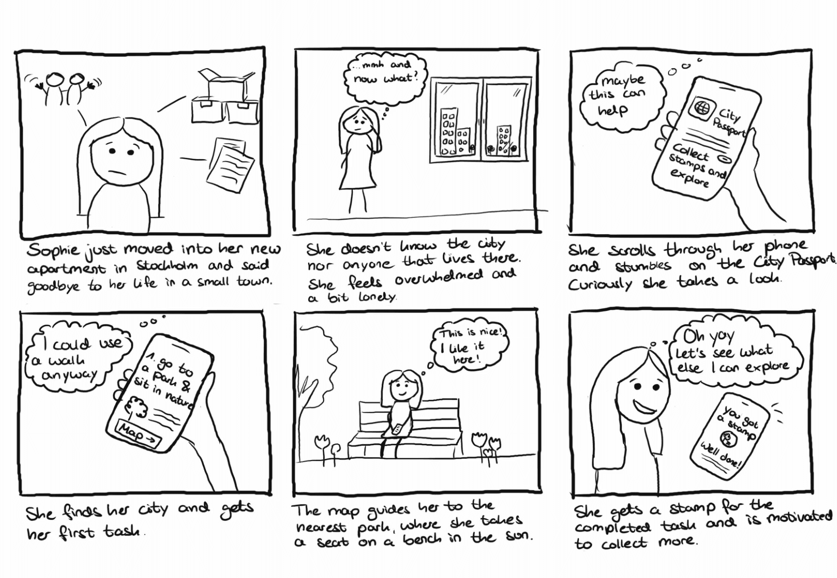
Shaping the Feature Set
Organizing the Experience
Mapping the journey

The Design Process
Low-Fidelity Wireframes
To kick off the design phase, I began by sketching low-fidelity wireframes focused on core user flows — particularly those I planned to test later.
Key screens included:
Log in
Landing page
Dashboard
Uploading a memory
At this stage, my goal was clarity and structure, not visual polish. Sketching early allowed me to prioritize usability and logic, ensuring the user journey felt intuitive before layering on aesthetics.

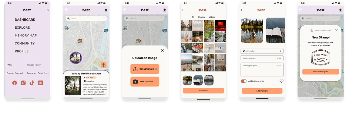
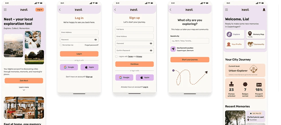
Mid-fidelity explorations
Once the structure was clear from sketching, I moved into Figma to create mid-fidelity wireframes. This phase helped me define layout, navigation, and flow while still focusing on usability rather than visual polish.

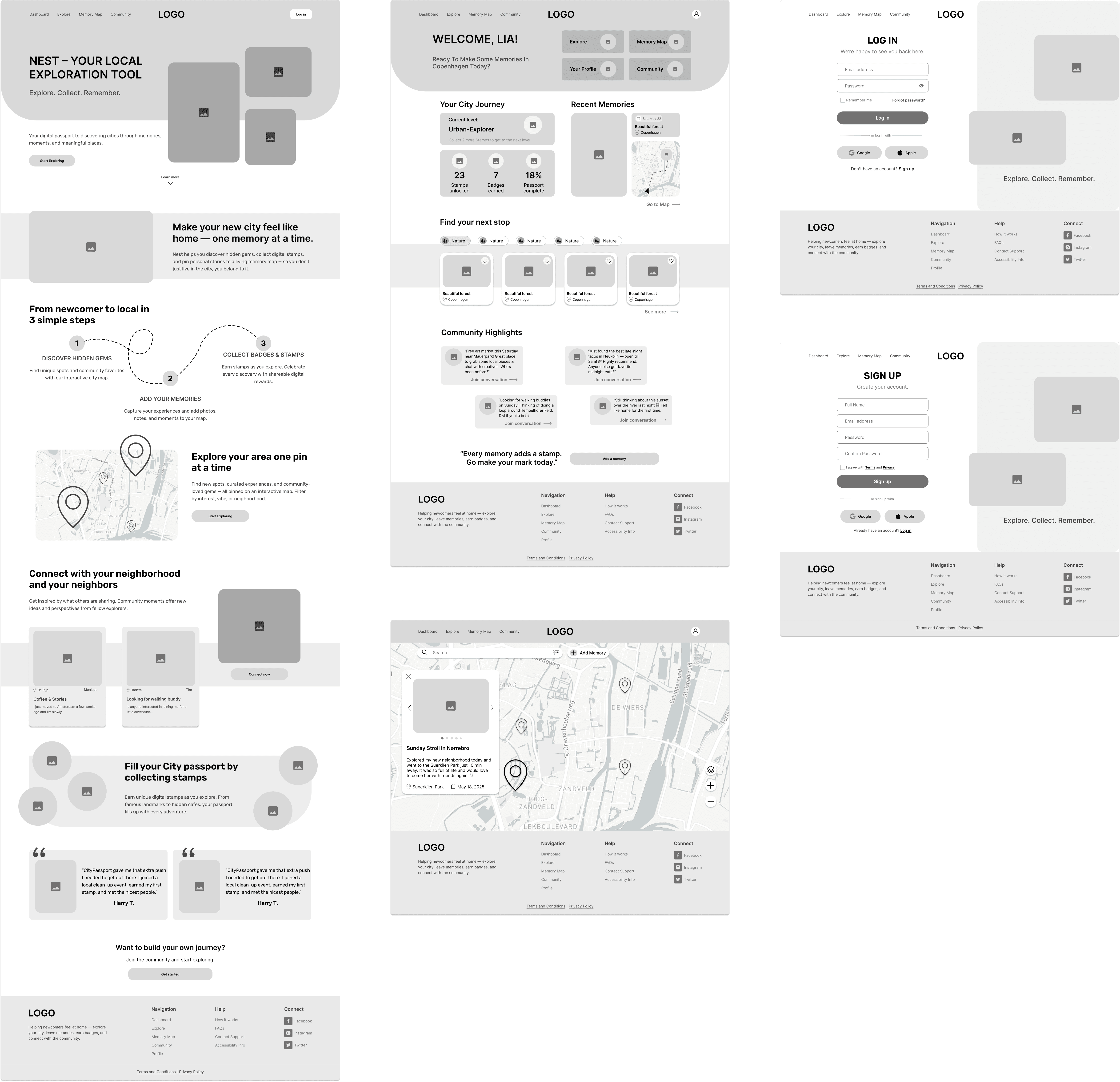
Desktop Optimization
After designing the mobile experience, I adapted Nest for desktop to ensure a consistent and responsive cross-device experience.
Building the brand identity
To align the visual tone of Nest with its purpose I developed a brand identity rooted in the values of belonging, warmth, discovery, connection, and ease.
I aimed to craft a visual language that feels personal, calming, and inviting — just like a soft landing in a new city.
Key Elements:
Calming Color Palette: Gentle hues create a soothing atmosphere while maintaining clarity and contrast and a sense of playfulness.
Typeface & Iconography: Clean and soft font paired with some custom icons to reflect simplicity and approachability.
Logo Design: The Nest logo is a soft, rounded wordmark paired with a small arrow and dot illustration—subtly hinting at exploration and personal growth.
UI Component Library: The component library ensures a consistent experience across screens reusable elements like buttons, cards, navigation, and forms, each with defined states. This system supported faster iteration while maintaining visual cohesion throughout the platform.
The goal was not just to make Nest look nice — but to make users feel supported, motivated, and at home in their new city.

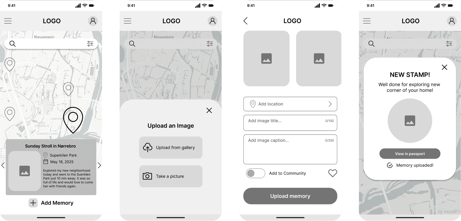
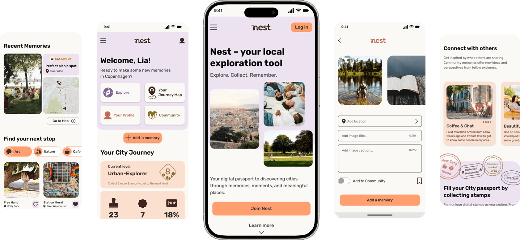
High-Fidelity Prototyping
Building on the visual foundation established through the brand identity, I brought these elements into the final product through high-fidelity designs.
I then created a functioning, clickable prototype, complete with micro-interactions like hover states and transitions. This allowed users to explore the full experience – from landing page to memory upload – and helped prepare the product for usability testing.
Usability Testing
To validate the high-fidelity prototype, I conducted moderated testing sessions with 5 users (ages 25–33), focusing on two essential flows: signing up and uploading a memory.
Objectives:
Ensure new users could navigate the product with ease
Test emotional clarity and satisfaction of interactions
Identify any friction points in the onboarding and memory upload flows
Key Takeaways:
All users successfully completed both tasks
Positive reactions to tone, reward system, and clean UI
Some confusion around terminology and button visibility
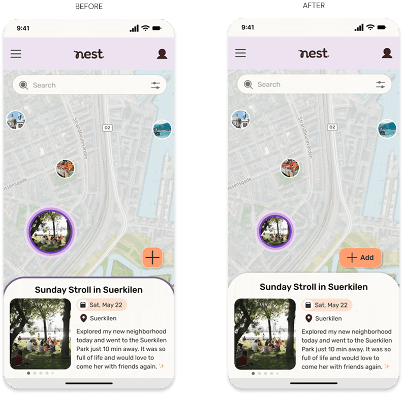
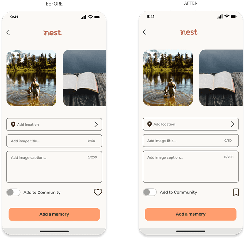
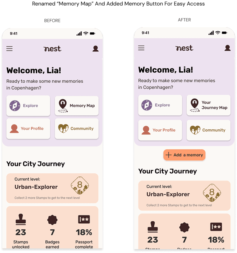
Main Areas for Improvement:
Upload button was too subtle on the map
“Use current location” button was overlooked
Heart icon resembled a "like" action
The term “Memory Map” wasn’t intuitive
Refinement & Iteration
Following testing, I prioritized changes based on impact and effort, focusing on clarity, confidence, and emotional usability.
These refinements helped ensure Nest feels intuitive and welcoming.

Final Prototype
Reflection & Key Takeaways
Nest was my first full end-to-end UX project, and it taught me quite a bit.
I began with a big question: How can we support people emotionally when they move to a new place? Through research and interviews, I discovered the real struggle isn’t moving — it’s settling in, emotionally and socially. That insight became the heart of Nest: a platform to help newcomers build small rituals, explore playfully, and feel more at home.
Throughout the project, I moved through the full UX process — from research and affinity mapping to wireframes, branding, high-fidelity prototypes, and usability testing.
What I Learned
Good research takes practice and empathy.
Small UX choices (like button names or layout clarity) have real impact.
Emotion matters. Design can feel warm, calming, and motivating.
Importance of iteration. Feedback led to tangible, smart improvements.
What Was Challenging
Navigating interviewing for the first time – staying focused, asking open questions, and resisting assumptions.
Not second-guessing every design decision and just trusting my process.
Balancing what’s ideal with what’s feasible, both in features and design scope.
What I’m Proud Of
Creating a concept centered on emotional wellbeing
Designing a cohesive, branded product from scratch
Staying grounded in user needs throughout
This project helped me build confidence and showed me how UX can truly make someone feel supported. I’m proud of where Nest landed – and excited for what’s next.
