UX/UI Case Study
Reducing group planning friction in Ticketmaster
Reducing group planning friction in Ticketmaster
Reducing group planning friction in Ticketmaster
Designing a collaborative planning flow for Ticketmaster that helps friends decide faster, share the planning load, and keep everything in one place.
Designing a collaborative planning flow for Ticketmaster that helps friends decide faster, share the planning load, and keep everything in one place.

ROLE
ROLE
ROLE
UX/UI Designer
UX Researcher
UX/UI Designer
UX Researcher
UX/UI Designer
UX Researcher
PRODUCT
PRODUCT
PRODUCT
Ticketmaster Concept
Feature, iOS App
Ticketmaster Concept
Feature, iOS App
Ticketmaster Concept
Feature, iOS App
TIMELINE
TIMELINE
TIMELINE
July-August 2025
(4 Weeks)
July-August 2025
(4 Weeks)
July-August 2025
(4 Weeks)
TOOLS
TOOLS
TOOLS
Figma, FigJam,
Otter AI, Zoom
Figma, FigJam,
Otter AI, Zoom
Figma, FigJam,
Otter AI, Zoom


"Plan with Friends" brings group event planning into Ticketmaster, giving friends a shared space to coordinate, vote, and decide together instead of juggling group chats and links.
"Plan with Friends" brings group event planning into Ticketmaster, giving friends a shared space to coordinate, vote, and decide together instead of juggling group chats and links.
Background
Background
Planning events with friends often starts with excitement — but quickly turns into scattered chats, delayed replies, and one person carrying the planning load.
Ticketmaster supports fast individual purchases, but group decisions push coordination into external tools, slowing things down and breaking momentum.
How might we keep group planning inside Ticketmaster and help friends decide together without pressure?
How might we keep group planning inside Ticketmaster and help friends decide together without pressure?

The Solution Preview
The Solution Preview
The Solution Preview
Plan with Friends brings group planning into Ticketmaster, giving friends a simple way to decide together without the usual back-and-forth.
It replaces scattered chats with a shared space that helps groups keep momentum from “we should go” to buying tickets.
Plan with Friends brings group planning into Ticketmaster, giving friends a simple way to decide together without the usual back-and-forth.
It replaces scattered chats with a shared space that helps groups keep momentum from “we should go” to buying tickets.
Research & Discovery
Research & Discovery
Research & Discovery
Research Goal
Understand why group event planning breaks down and how Ticketmaster could support group decisions without adding friction to the existing experience.
Understand why group event planning breaks down and how Ticketmaster could support group decisions without adding friction to the existing experience.
Key Insights Summary
Key Insights Summary
Planning happens outside Ticketmaster
Planning happens outside Ticketmaster
Group decisions move to chats and screenshots, breaking momentum between discovery and purchase.
Group decisions move to chats and screenshots, breaking momentum between discovery and purchase.
Group decisions move to chats and screenshots, breaking momentum between discovery and purchase.
Decisions often stall
Decisions often stall
Progress depends on waiting for responses, creating frustration and delays.
Progress depends on waiting for responses, creating frustration and delays.
Progress depends on waiting for responses, creating frustration and delays.
Passive participants shape outcomes
Passive participants shape outcomes
Silence and hesitation influence decisions as much as active input.
Silence and hesitation influence decisions as much as active input.
Silence and hesitation influence decisions as much as active input.
Emotional momentum drops early
Emotional momentum drops early
Excitement fades during coordination — before ticket selection even begins.
Excitement fades during coordination — before ticket selection even begins.
Excitement fades during coordination — before ticket selection even begins.
Why group planning breaks down
Why group planning breaks down
Based on user interviews and affinity mapping
I conducted interviews with five active planners to understand where and why planning slows down.
Across interviews, common patterns emerged:
Conversations became disorganized across platforms
Decisions dragged on due to waiting for responses
Planning responsibility fell on one or two people
Affinity mapping showed that the main issue was not disagreement, but waiting. Progress often stalled while planners waited for confirmation or engagement from others.
This shifted the focus from planning faster to planning with less friction.
“I don’t want to be the one always planning.”
– Elizabeth, 23
“If I don’t organize it, it doesn’t happen.”
– Ben, 27
"I waited for a response and then the best tickets where already sold out"
– Chiara, 29
“If I don’t organize it, it doesn’t happen.”
– Ben, 27
“I don’t want to be the one always planning.”
– Elizabeth, 23
"I waited for a response and then the best tickets where already sold out"
– Chiara, 29
The hidden role of passive participants
The hidden role of passive participants
Planner and passive user perspectives
Early research focused primarily on planners, but findings revealed the strong influence of passive participants.
Insights from interviews showed:
Passive users wanted to be included without pressure
Delayed responses were often interpreted as disinterest
Planners felt blocked even when others were still interested
Including a passive participant perspective helped reframe the problem. A successful solution needed to support both planners and less active users equally.
How people currently plan events together
How people currently plan events together
Secondary research + competitive analysis
To understand existing behaviors, I reviewed common planning tools such as Eventbrite, WhatsApp, and DICE alongside Ticketmaster’s current experience.
Key observations included:
Ticketmaster supports fast individual purchases but not group coordination
Users rely on multiple external tools to share links, discuss options, and confirm availability
Each tool supports part of the process, but none connect planning with ticket purchase
This fragmentation revealed an opportunity for Ticketmaster to keep users engaged by supporting collaboration directly within the platform.
Emotional highs and lows in the planning journey
Emotional highs and lows in the planning journey
Empathy Mapping
Empathy mapping helped visualize how emotions shifted throughout the planning process.
Key emotional patterns included:
High excitement during event discovery
Frustration during coordination and logistics
Loss of momentum before ticket selection
This revealed a critical opportunity to intervene earlier in the journey and help sustain excitement through clearer progress and shared visibility.
The feature needs to reduce emotional load, simplify decisions, and share the planning responsibility between friends - not just make buying tickets faster.
The feature needs to reduce emotional load, simplify decisions, and share the planning responsibility between friends - not just make buying tickets faster.
The feature needs to reduce emotional load, simplify decisions, and share the planning responsibility between friends - not just make buying tickets faster.
The Personas
The Personas
From the research two clear archetypes emerged: the overwhelmed organiser and the easy-going friend who wants to join without doing all the legwork.
From the research two clear archetypes emerged: the overwhelmed organiser and the easy-going friend who wants to join without doing all the legwork.
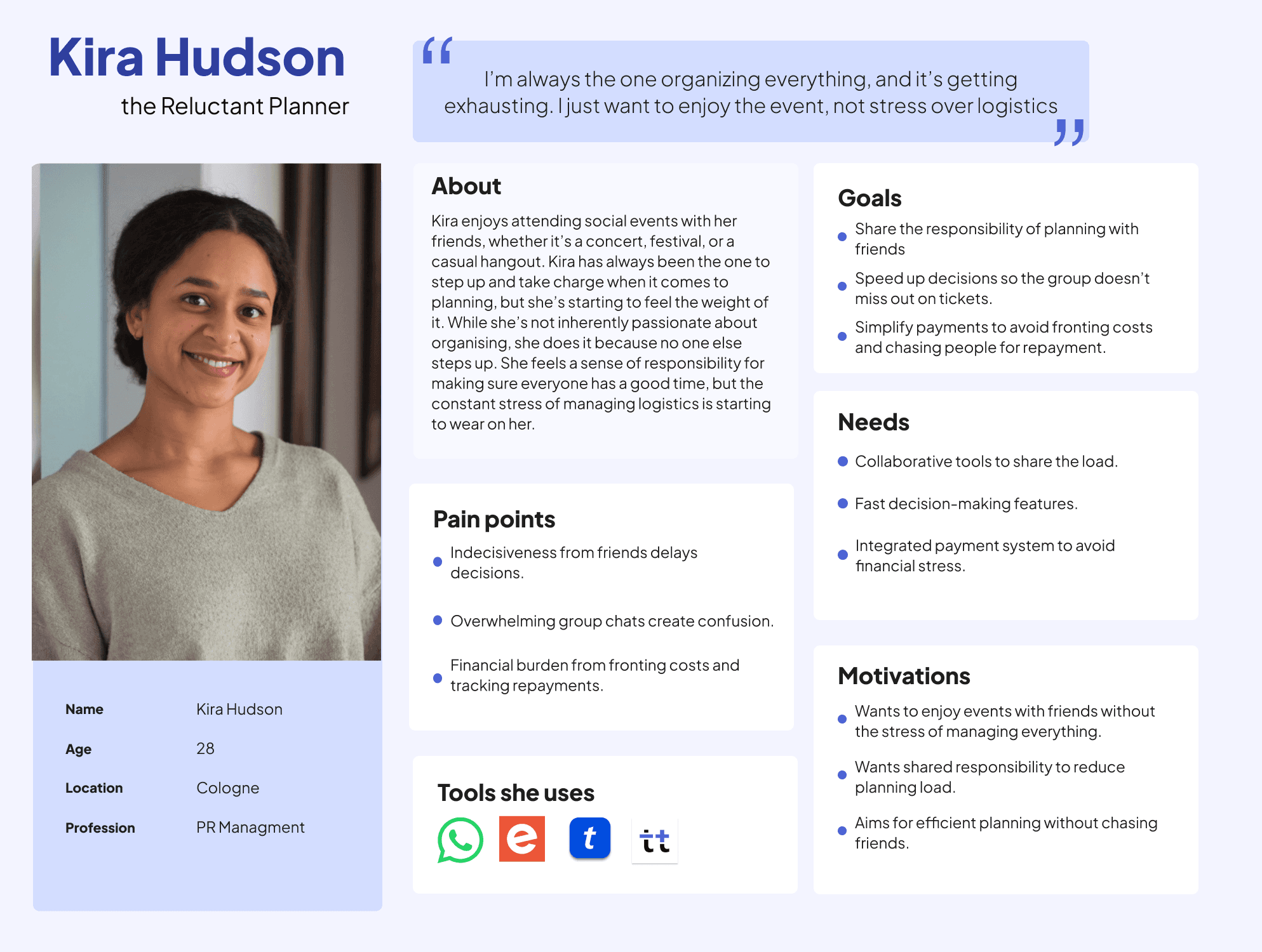
Kira – The Reluctant Planner
Kira loves going to events with friends but often ends up organising everything herself. She worries about letting people down, feels responsible for keeping plans moving, and carries the emotional weight of making the “right” decision.
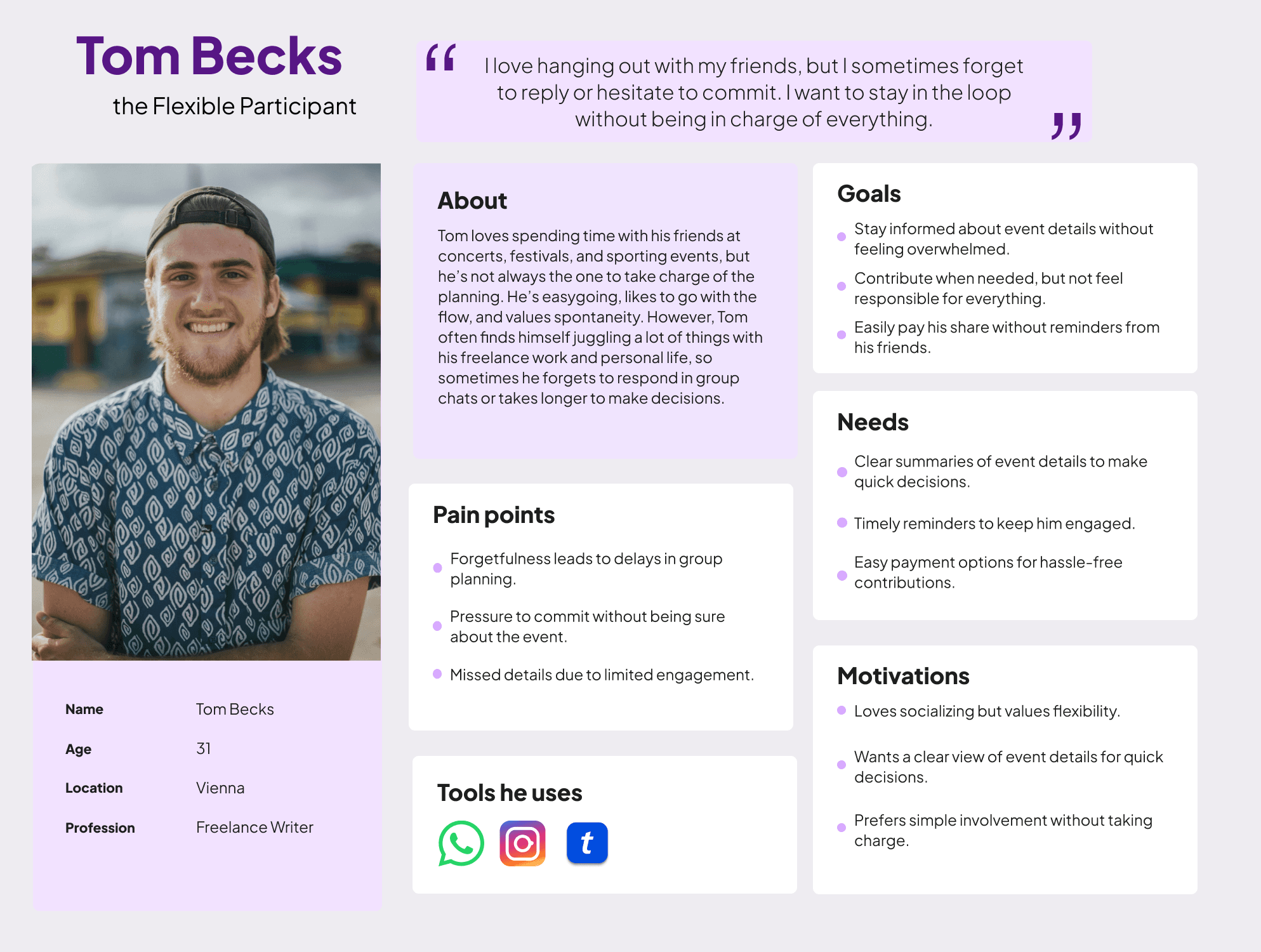
Tom – The Flexible Participant
Tom is easy-going and loves being included, but he often forgets to reply or feels overwhelmed when too many options appear at once. He needs simple choices, clear information, and gentle nudges to stay engaged.
Kira – The Reluctant Planner
Kira loves going to events with friends but often ends up organising everything herself. She worries about letting people down, feels responsible for keeping plans moving, and carries the emotional weight of making the “right” decision.
Tom – The Flexible Participant
Tom is easy-going and loves being included, but he often forgets to reply or feels overwhelmed when too many options appear at once. He needs simple choices, clear information, and gentle nudges to stay engaged.
The Challenge
The Challenge
Kira and Tom want to enjoy events together, yet their needs clash in subtle ways. Kira wants support, clarity, and shared responsibility. Tom needs a low-effort experience that keeps him involved without adding pressure.
This tension shaped the core challenge of the project:
Kira and Tom want to enjoy events together, yet their needs clash in subtle ways. Kira wants support, clarity, and shared responsibility. Tom needs a low-effort experience that keeps him involved without adding pressure.
This tension shaped the core challenge of the project:
How might we help Kira share tasks and decisions in a natural way?
How might we help Kira share tasks and decisions in a natural way?
How might we design a flow that prompts Tom gently without pressure?
How might we design a flow that prompts Tom gently without pressure?
The Solution: "Plan with Friends"
The Solution: "Plan with Friends"
The Solution: "Plan with Friends"
"Plan With Friends" brings group planning into Ticketmaster so friends can make decisions without juggling multiple apps. It balances the needs of both planners and passive participants, making the process feel lighter and more collaborative.
"Plan With Friends" brings group planning into Ticketmaster so friends can make decisions without juggling multiple apps. It balances the needs of both planners and passive participants, making the process feel lighter and more collaborative.
Create a group for an event
Create a group for an event
Start a planning space directly from the event page or your account.
Start a planning space directly from the event page or your account.
Invite friends
Invite friends
Send invitations via link or directly from your friend list.
Send invitations via link or directly from your friend list.
Create and vote in polls
Create and vote in polls
Let the group decide on dates, seats, or events with clear, time-bound polls.
Let the group decide on dates, seats, or events with clear, time-bound polls.
Shared dashboard
Shared dashboard
See all event details, decisions, and next steps in one place.
See all event details, decisions, and next steps in one place.
In-app chat threads
In-app chat threads
Keep conversation focused around a specific event instead of scattered across chats.
Keep conversation focused around a specific event instead of scattered across chats.
Gentle reminders
Gentle reminders
Nudge friends who haven’t voted or confirmed yet, reducing pressure on the planner.
Nudge friends who haven’t voted or confirmed yet, reducing pressure on the planner.
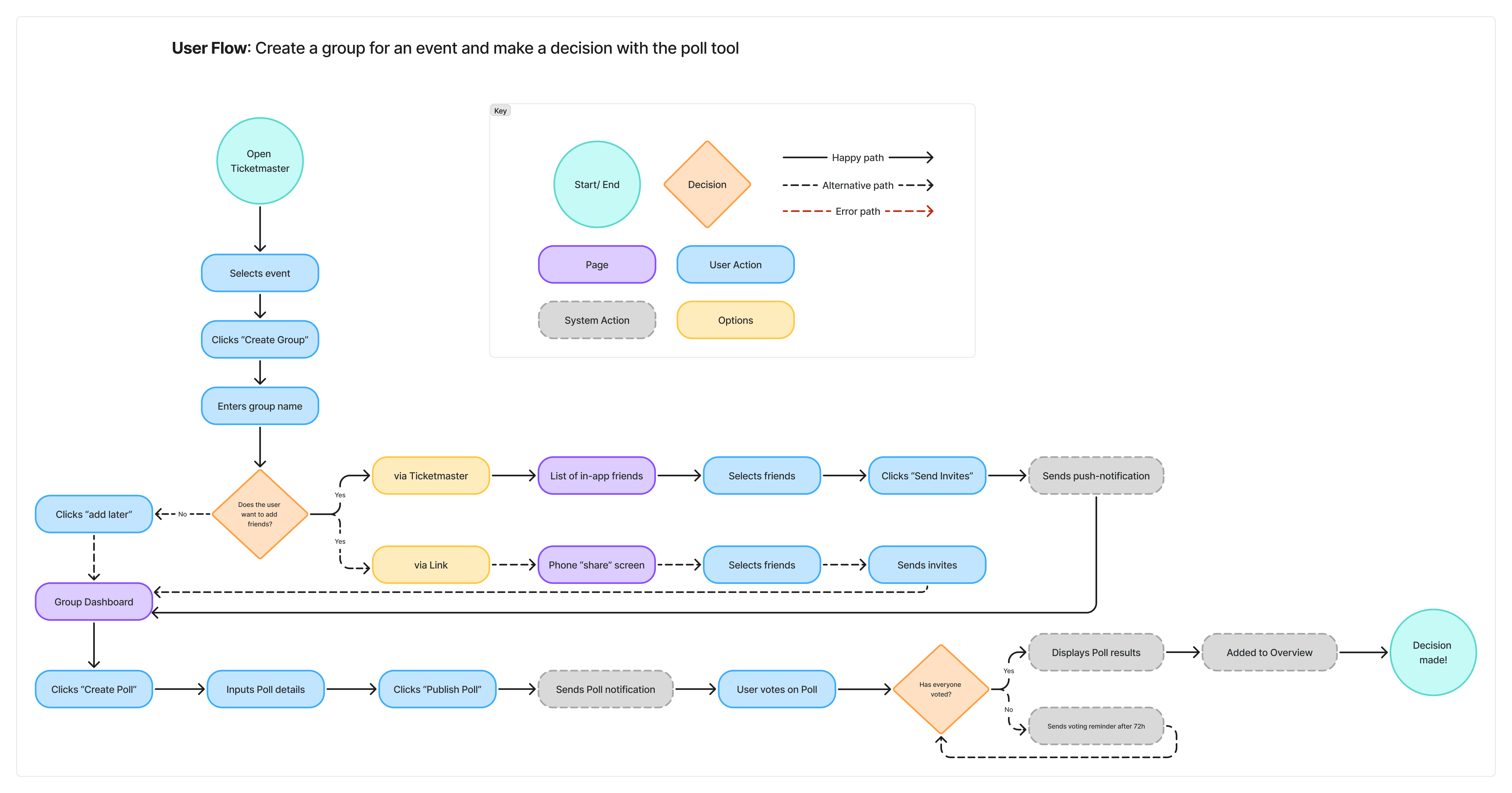
Mapping the Journey
Mapping the Journey
Mapping the Journey
Understanding how both roles move through the flow was essential. I mapped the journey from discovering an event to confirming tickets to ensure the feature supported forward momentum rather than adding friction.
The flow highlights two perspectives working together toward a shared decision:
Understanding how both roles move through the flow was essential. I mapped the journey from discovering an event to confirming tickets to ensure the feature supported forward momentum rather than adding friction.
The flow highlights two perspectives working together toward a shared decision:
The Planner – starts the group, creates polls, nudges the group forward
The Participant – joins, votes, and stays updated without having to manage everything
The Planner – starts the group, creates polls, nudges the group forward
The Participant – joins, votes, and stays updated without having to manage everything
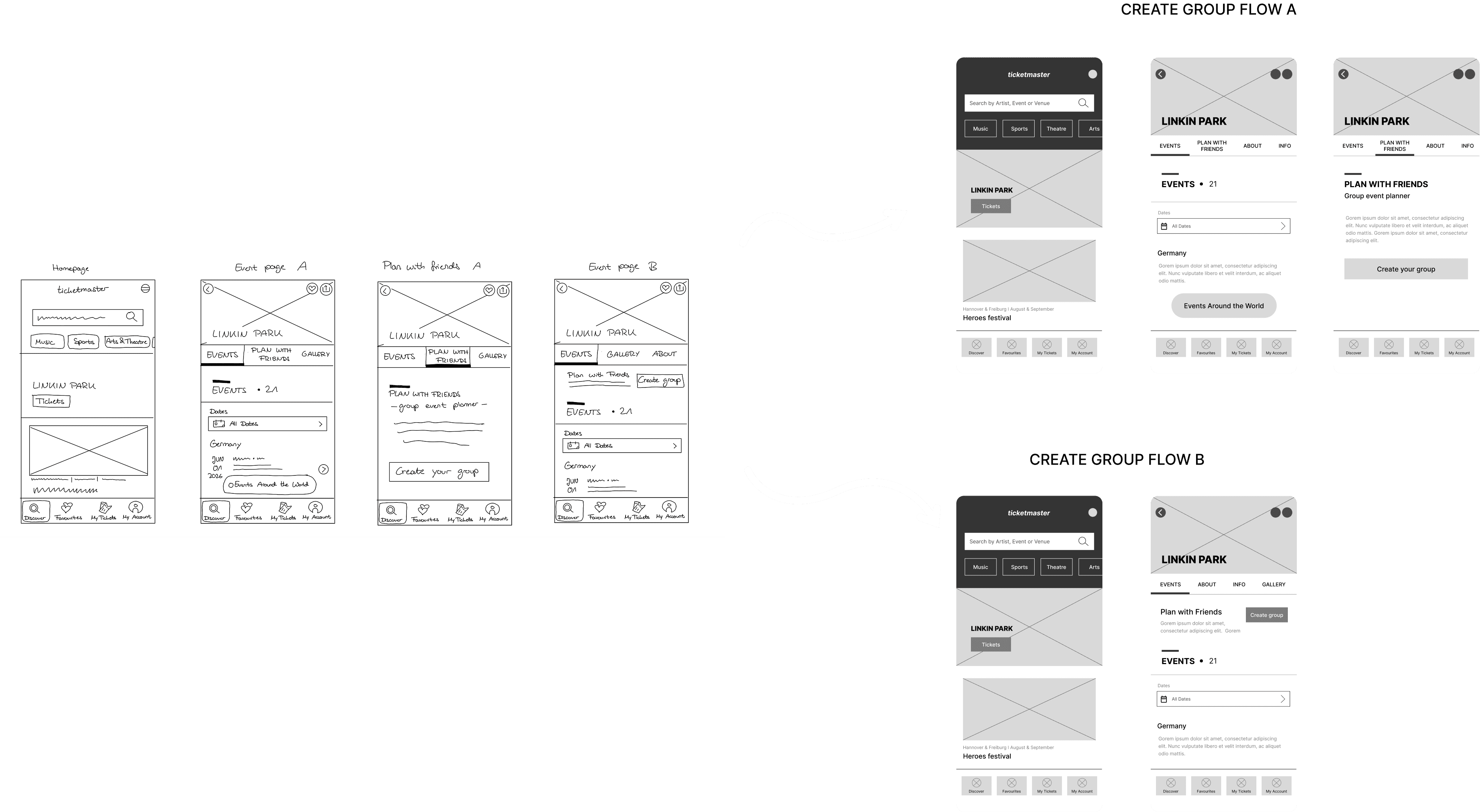
Wireframes: From Low to Mid-Fidelity
Wireframes: From Low to Mid-Fidelity
Wireframes:
From Low to Mid-Fidelity
Once the concept was defined, I moved into wireframing to turn ideas into tangible flows. I started with quick low-fidelity layouts to nail the structure and decision points, then evolved them into mid-fidelity screens that align more closely with Ticketmaster’s existing patterns.
Once the concept was defined, I moved into wireframing to turn ideas into tangible flows. I started with quick low-fidelity layouts to nail the structure and decision points, then evolved them into mid-fidelity screens that align more closely with Ticketmaster’s existing patterns.
Accessing the feature and creating a group - Version A and B
Accessing the feature and creating a group - Version A and B
I explored two entry points for creating a group to understand what would feel most natural in the existing Ticketmaster flow. Version A introduces a dedicated “Plan with Friends” tab, while Version B places a “Create group” action directly on the event page.
I explored two entry points for creating a group to understand what would feel most natural in the existing Ticketmaster flow. Version A introduces a dedicated “Plan with Friends” tab, while Version B places a “Create group” action directly on the event page.
Inviting friends via Ticketmaster or via link
Inviting friends via Ticketmaster or via link
Because not everyone in a group is already on Ticketmaster, I explored two invitation paths. Friends could be invited directly through Ticketmaster or via a shareable link, reducing friction at the very start of planning.
Because not everyone in a group is already on Ticketmaster, I explored two invitation paths. Friends could be invited directly through Ticketmaster or via a shareable link, reducing friction at the very start of planning.

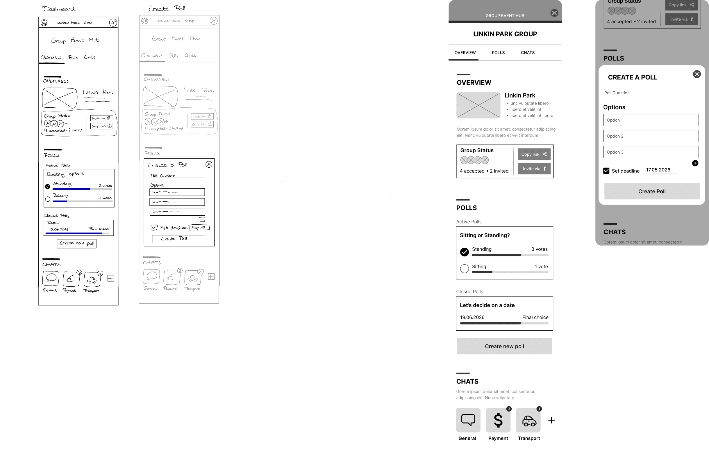
Group Dashboard with Event overview, Poll and Chat Section + "Create a Poll"- pop-up
Group Dashboard with Event overview, Poll and Chat Section + "Create a Poll"- pop-up
Because group decisions often stall when information is scattered, I designed a central group dashboard that brings event details, polls, and chat into one shared view. Creating a poll directly within the dashboard makes decision-making visible and easier for both active planners and quieter participants.
Because group decisions often stall when information is scattered, I designed a central group dashboard that brings event details, polls, and chat into one shared view. Creating a poll directly within the dashboard makes decision-making visible and easier for both active planners and quieter participants.
First High-Fidelity
First High-Fidelity
First High-Fidelity
After refining the flow with low-fidelity testing, I created the first high-fidelity version using Ticketmaster’s brand identity and interface patterns. This version made the experience feel closer to the real app and addressed the most important early feedback.
After refining the flow with low-fidelity testing, I created the first high-fidelity version using Ticketmaster’s brand identity and interface patterns. This version made the experience feel closer to the real app and addressed the most important early feedback.

Usability Testing – High-Fidelity
Usability Testing – High-Fidelity
Usability Testing – High-Fidelity
To validate the updated design, I ran a second round of moderated usability tests with five users. This round focused on the two core tasks:
Starting a planning group and inviting friends
Creating and interacting with a poll
To validate the updated design, I ran a second round of moderated usability tests with five users. This round focused on the two core tasks:
Starting a planning group and inviting friends
Creating and interacting with a poll
What went well
What went well
Group creation and invitations felt intuitive and flexible
The feature felt well integrated into Ticketmaster’s existing experience
Onboarding messages helped users understand the flow
Invite methods (contacts or link) were clear and appreciated
Group creation and invitations felt intuitive and flexible
The feature felt well integrated into Ticketmaster’s existing experience
Onboarding messages helped users understand the flow
Invite methods (contacts or link) were clear and appreciated
What could be improved
What could be improved
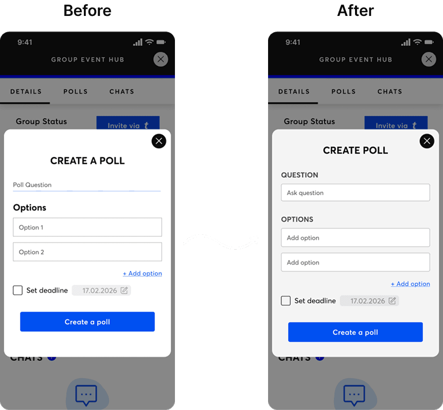
Some interactive elements (like the poll question field) weren’t perceived as clickable
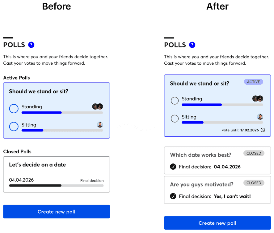
Poll confirmations and deadlines needed more visibility
Navigation back to the group dashboard wasn’t always clear
The homepage pop-up caused confusion as an entry point
Notifications (like “Friend voted”) were often overlooked
Some interactive elements (like the poll question field) weren’t perceived as clickable
Poll confirmations and deadlines needed more visibility
Navigation back to the group dashboard wasn’t always clear
The homepage pop-up caused confusion as an entry point
Notifications (like “Friend voted”) were often overlooked
Key takeaway:
Users completed all tasks successfully, but small usability blockers around clarity, feedback, and navigation needed refinement before the final iteration.
Iterations
Create a Poll Screen
Iterations:
Added visible deadline text to active poll to set clear expectations
Removed voting bar
Applied additional visual styling to further differentiate closed polls from active ones
Created Poll
Iterations:
Added visible deadline text to active poll to set clear expectations
Removed voting bar
Applied additional visual styling to further differentiate closed polls from active ones
Poll Confirmation Screen
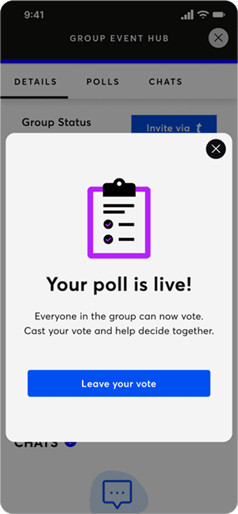
Iterations:
Added a confirmation screen for successful poll creation
Provided short instructional text to explain next steps
Included a call-to-action button (“Leave your vote”) to guide user flow
Example Chat Screen
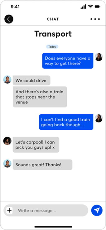
Iterations:
Designed a basic chat screen to meet user expectations
Added placeholder messages and input field to reflect intended interaction flow
Helps convey the vision of a complete, collaborative group planning tool
Additional entry point
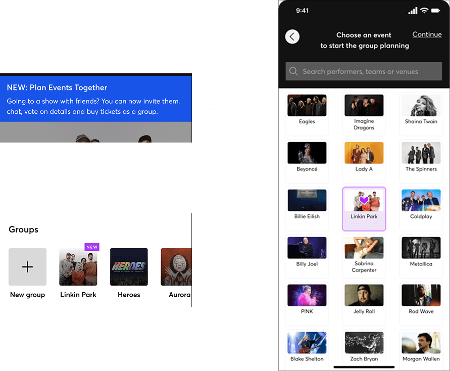
Iterations:
Made the home screen pop-up a tappable entry point into the group planning flow as well under “My Account” > Groups
Introduced event selection to initiate the planning experience
Aligns better with user expectations and supports various entry behaviors
Create a Poll Screen
Iterations:
Added visible deadline text to active poll to set clear expectations
Removed voting bar
Applied additional visual styling to further differentiate closed polls from active ones
Created Poll
Iterations:
Added visible deadline text to active poll to set clear expectations
Removed voting bar
Applied additional visual styling to further differentiate closed polls from active ones
Poll Confirmation Screen
Iterations:
Added a confirmation screen for successful poll creation
Provided short instructional text to explain next steps
Included a call-to-action button (“Leave your vote”) to guide user flow
Example Chat Screen
Iterations:
Designed a basic chat screen to meet user expectations
Added placeholder messages and input field to reflect intended interaction flow
Helps convey the vision of a complete, collaborative group planning tool
Additional entry point
Iterations:
Made the home screen pop-up a tappable entry point into the group planning flow as well under “My Account” > Groups
Introduced event selection to initiate the planning experience
Aligns better with user expectations and supports various entry behaviors
Create a Poll Screen
Iterations:
Added visible deadline text to active poll to set clear expectations
Removed voting bar
Applied additional visual styling to further differentiate closed polls from active ones
Created Poll
Iterations:
Added visible deadline text to active poll to set clear expectations
Removed voting bar
Applied additional visual styling to further differentiate closed polls from active ones
Poll Confirmation Screen
Iterations:
Added a confirmation screen for successful poll creation
Provided short instructional text to explain next steps
Included a call-to-action button (“Leave your vote”) to guide user flow
Additional entry point
Iterations:
Made the home screen pop-up a tappable entry point into the group planning flow as well under “My Account” > Groups
Introduced event selection to initiate the planning experience
Aligns better with user expectations and supports various entry behaviors
Example Chat Screen
Iterations:
Designed a basic chat screen to meet user expectations
Added placeholder messages and input field to reflect intended interaction flow
Helps convey the vision of a complete, collaborative group planning tool
Further Navigation and Notification Changes
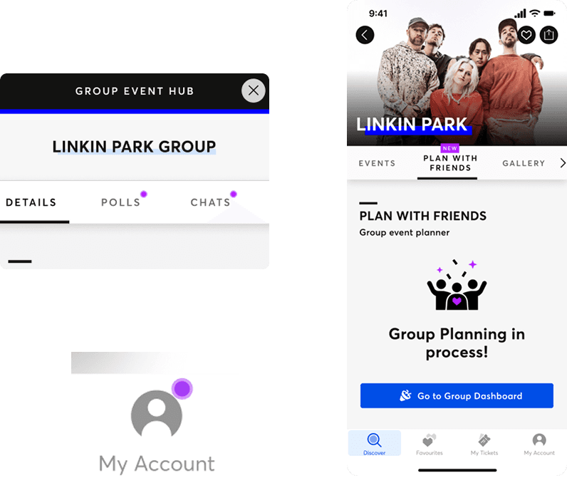
Iterations:
Introduced notification dots to highlight actions that need attention
After creating a group, the “Plan with Friends” tab dynamically updates to show the group in progress as well as a CTA leading back to the dashboard
Create a Poll Screen
Iterations:
Added visible deadline text to active poll to set clear expectations
Removed voting bar
Applied additional visual styling to further differentiate closed polls from active ones
Created Poll
Iterations:
Added visible deadline text to active poll to set clear expectations
Removed voting bar
Applied additional visual styling to further differentiate closed polls from active ones
Poll Confirmation Screen
Iterations:
Added a confirmation screen for successful poll creation
Provided short instructional text to explain next steps
Included a call-to-action button (“Leave your vote”) to guide user flow
Additional entry point
Iterations:
Made the home screen pop-up a tappable entry point into the group planning flow as well under “My Account” > Groups
Introduced event selection to initiate the planning experience
Aligns better with user expectations and supports various entry behaviors
Example Chat Screen
Iterations:
Designed a basic chat screen to meet user expectations
Added placeholder messages and input field to reflect intended interaction flow
Helps convey the vision of a complete, collaborative group planning tool
Further Navigation and Notification Changes
Iterations:
Introduced notification dots to highlight actions that need attention
After creating a group, the “Plan with Friends” tab dynamically updates to show the group in progress as well as a CTA leading back to the dashboard
The result is a more collaborative, transparent planning process that keeps the excitement of going to an event together, without the usual stress and coordination chaos.
The result is a more collaborative, transparent planning process that keeps the excitement of going to an event together, without the usual stress and coordination chaos.
The result is a more collaborative, transparent planning process that keeps the excitement of going to an event together, without the usual stress and coordination chaos.

Reflections & Next Steps
Reflections & Next Steps
Reflections & Next Steps
This project taught me how powerful it is to test early and design for different participation styles. Even low-fidelity prototypes revealed issues with navigation and feedback that I wouldn’t have caught from static screens alone.
Designing inside an existing system like Ticketmaster’s meant borrowing familiar components while still pushing for new behaviour – a balance between respecting constraints and advocating for user needs.
If I had more time, I’d explore:
If I had more time, I’d explore:
If I had more time, I’d explore:
Split payments and clearer cost-splitting flows
Group seat reservations before checkout
Richer notification settings and chat features for ongoing planning
Split payments and clearer cost-splitting flows
Group seat reservations before checkout
Richer notification settings and chat features for ongoing planning
Let's create something extraordinary
Let's create something extraordinary
If you’d like to collaborate on a digital product, improve a feature, or bring a new idea to life, I’d love to chat.
