
UX/UI Case Study
Nest – Designing belonging in a new city
Nest – Designing belonging in a new city
Nest – Designing belonging in a new city
Designing a digital companion that supports newcomers in building routines, forming connections, and feeling at home after relocation.
Designing a digital companion that supports newcomers in building routines, forming connections, and feeling at home after relocation.
Designing a digital companion that supports newcomers in building routines, forming connections, and feeling at home after relocation.
ROLE
ROLE
ROLE
UX/UI Designer
(End-to-End)
UX/UI Designer
(End-to-End)
PRODUCT
PRODUCT
PRODUCT
Nest Concept
Mobile App
Nest Concept
Mobile App
TIMELINE
TIMELINE
TIMELINE
April-May 2025
(6 Weeks)
April-May 2025
(6 Weeks)
April-May 2025
(6 Weeks)
TOOLS
TOOLS
TOOLS
Figma, FigJam, Prototyping
Qualitative Research
Figma, FigJam,
Qualitative Research
Figma, FigJam, Prototyping
Qualitative Research

“Nest” supports newcomers in building routines, forming local connections, and feeling at home by turning the emotional transition of moving into a more grounded and confident experience.
“Nest” supports newcomers in building routines, forming local connections, and feeling at home by turning the emotional transition of moving into a more grounded and confident experience.
The Problem
The Problem
Relocation is often treated as a logistical challenge. Finding housing, handling paperwork, and organizing transport are well supported.
What remains largely unaddressed is the emotional transition. After the move, many newcomers struggle with uncertainty, isolation, and the difficulty of building routines or meaningful local connections.
This gap presents an opportunity to design for belonging, not just organization.
How might we support newcomers in feeling grounded and connected after relocation?
How might we support newcomers in feeling grounded and connected after relocation?

The Solution Preview
The Solution Preview
The Solution Preview
Nest is a digital companion designed to guide newcomers through the emotional side of settling in.
It encourages exploration, routine formation, and community connection to help transform unfamiliar surroundings into a place that feels like home.
Nest is a digital companion designed to guide newcomers through the emotional side of settling in.
It encourages exploration, routine formation, and community connection to help transform unfamiliar surroundings into a place that feels like home.
Research & Discovery
Research & Discovery
Research & Discovery
Before designing Nest, I explored what truly makes moving to a new place challenging, not just practically, but emotionally.
Through secondary research, competitive analysis, and qualitative interviews, I aimed to uncover where current tools fall short.
To understand where hesitation starts, I explored how people currently find and join social fitness activities. The research combined qualitative insights with broader validation to uncover patterns around uncertainty, confidence, and decision-making.
Rather than focusing on a single method, I used a mix of approaches to capture both how people feel and how common those experiences are.
Secondary Research
Secondary Research
I reviewed studies, trend articles, and online discussions around relocation.
Key findings
• Most tools focus on logistical support such as packing and housing
• Emotional and social guidance is largely missing
• Remote work and urban loneliness increase emotional challenges
• Community platforms exist, but are not tailored to newcomers
I conducted interviews with five active planners to understand where and why planning slows down.
Across interviews, common patterns emerged:
Conversations became disorganized across platforms
Decisions dragged on due to waiting for responses
Planning responsibility fell on one or two people
Affinity mapping showed that the main issue was not disagreement, but waiting. Progress often stalled while planners waited for confirmation or engagement from others.
This shifted the focus from planning faster to planning with less friction.
Competitive Analysis
Competitive Analysis
I initially explored a wide range of relocation tools.
However, after speaking with users, it became clear that the real challenge is not moving, but settling in.
While platforms support events or local discovery, none guide the personal journey of:
• Building routines
• Reflecting on experiences
• Creating emotional anchors
I conducted interviews with five active planners to understand where and why planning slows down.
Across interviews, common patterns emerged:
Conversations became disorganized across platforms
Decisions dragged on due to waiting for responses
Planning responsibility fell on one or two people
Affinity mapping showed that the main issue was not disagreement, but waiting. Progress often stalled while planners waited for confirmation or engagement from others.
This shifted the focus from planning faster to planning with less friction.

Qualitative Interviews
Qualitative Interviews
I conducted 6 semi-structured interviews with people who had recently relocated, both domestically and internationally.
The conversations focused on emotional adjustment and routine building. I synthesized the responses using an affinity map to identify emerging themes.
Patterns that surfaced
• The physical move was rarely the issue
• Many felt lost once logistics were complete
• There was a strong desire for routine and grounding
• Those who moved abroad especially needed clear guidance
I conducted interviews with five active planners to understand where and why planning slows down.
Across interviews, common patterns emerged:
Conversations became disorganized across platforms
Decisions dragged on due to waiting for responses
Planning responsibility fell on one or two people
Affinity mapping showed that the main issue was not disagreement, but waiting. Progress often stalled while planners waited for confirmation or engagement from others.
This shifted the focus from planning faster to planning with less friction.

Key Insight: The hardest part of moving is not the move itself, but settling in emotionally, socially, and practically.
Key Insight: The hardest part of moving is not the move itself, but settling in emotionally, socially, and practically.
How might we support newcomers in settling in emotionally, socially, and practically after relocation?
How might we support newcomers in settling in emotionally, socially, and practically after relocation?
Designing with Real People in Mind
Who Moov is
designed for
To bring the research to life, I created three personas representing different types of people who recently relocated. While all informed the process, one primary persona guided key design decisions.
The personas served as reference points throughout ideation and prototyping, ensuring the solution remained grounded in real motivations and challenges.

The Disconnected Settler
Eager to feel at home, but unsure how to build a life that feels aligned.
• Struggles to establish grounding routines
• Feels emotionally disconnected
• Needs guidance to turn exploration into belonging
The Hesitant Connector
Wants to meet new people but feels hesitant to take the first step.
• Avoids overwhelming social settings
• Unsure where she fits
• Needs low-pressure, welcoming ways to connect
The Cultural Explorer
Motivated to integrate, yet feels caught between communities.
• Seeks meaningful local connections
• Faces language and cultural barriers
• Needs support navigating integration confidentlyThe Disconnected Settler
Eager to feel at home, but unsure how to build a life that feels aligned.
• Struggles to establish grounding routines
• Feels emotionally disconnected
• Needs guidance to turn exploration into belongingThe Hesitant Connector
Wants to meet new people but feels hesitant to take the first step.
• Avoids overwhelming social settings
• Unsure where she fits
• Needs low-pressure, welcoming ways to connectThe Cultural Explorer
Motivated to integrate, yet feels caught between communities.
• Seeks meaningful local connections
• Faces language and cultural barriers
• Needs support navigating integration confidently
The Disconnected Settler
Eager to feel at home, but unsure how to build a life that feels aligned.
• Struggles to establish grounding routines
• Feels emotionally disconnected
• Needs guidance to turn exploration into belongingThe Hesitant Connector
Wants to meet new people but feels hesitant to take the first step.
• Avoids overwhelming social settings
• Unsure where she fits
• Needs low-pressure, welcoming ways to connectThe Cultural Explorer
Motivated to integrate, yet feels caught between communities.
• Seeks meaningful local connections
• Faces language and cultural barriers
• Needs support navigating integration confidentlyThe Disconnected Settler
Eager to feel at home, but unsure how to build a life that feels aligned.
• Struggles to establish grounding routines
• Feels emotionally disconnected
• Needs guidance to turn exploration into belongingThe Hesitant Connector
Wants to meet new people but feels hesitant to take the first step.
• Avoids overwhelming social settings
• Unsure where she fits
• Needs low-pressure, welcoming ways to connectThe Cultural Explorer
Motivated to integrate, yet feels caught between communities.
• Seeks meaningful local connections
• Faces language and cultural barriers
• Needs support navigating integration confidently
From Relocation to Belonging
From Relocation to Belonging
From Relocation to Belonging
Nest was designed as a response to the emotional gap identified in the research. Rather than focusing on logistics, the concept centers on supporting integration, helping newcomers explore intentionally, build routines, and form meaningful connections.
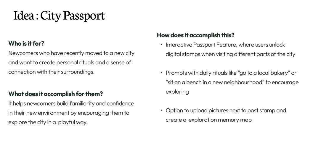
Guided by the research insights and the How Might We question, I explored different directions through brainstorming, sketching, and storyboarding. The early concept, originally called “City Passport,” focused on small moments of discovery and routine building. Over time, it evolved into Nest, a name that reflects something personal, built gradually, and rooted over time.
At its core, Nest encourages users to:
• Explore the city and collect memories
• Reflect on experiences
• Build connection through shared journeys
Understanding how both roles move through the flow was essential. I mapped the journey from discovering an event to confirming tickets to ensure the feature supported forward momentum rather than adding friction.
The flow highlights two perspectives working together toward a shared decision:
Turning insights into a clear flow
With requirements and personas defined, the next step was shaping a structure that helps users move from discovery to decision without feeling overwhelmed.
Moov is organized around a simple journey: exploring what’s available close by, understanding whether something feels like a good fit, and only then deciding to join.

The Core Experience
The Core Experience
The Core Experience
To shape the final solution, I prioritized features that support routine building, emotional grounding, and connection.
The core experience includes:
To shape the final solution, I prioritized features that support routine building, emotional grounding, and connection.
The core experience includes:
To shape the final solution, I prioritized features that support routine building, emotional grounding, and connection.
The core experience includes:
Memory Map
Memory Map
Pin memories to meaningful local places.
Pin memories to meaningful local places.
Digital Passport
Digital Passport
Earn stamps by exploring different parts of the city.
Earn stamps by exploring different parts of the city.
Level System
Level System
Track progress to motivate continued discovery.
Track progress to motivate continued discovery.
Explore Feed
Explore Feed
Discover local rituals and shared journeys.
Discover local rituals and shared journeys.
Community Page
Community Page
Connect in a light, low-pressure way.
Connect in a light, low-pressure way.
Custom Profile
Custom Profile
Create a personal space that grows over time.
Create a personal space that grows over time.
Structuring the Experience
Structuring the Experience
Structuring the Experience
With the core features defined, I translated the concept into a clear structure and defined how users would move through the platform.
With the core features defined, I translated the concept into a clear structure and defined how users would move through the platform.
Information Architecture
Information Architecture
Information Architecture
The sitemap established the main areas of Nest and how they connect. The structure was designed to feel simple and intentional, guiding users without overwhelming them.
The experience is centered around:
• Exploring new places
• Capturing memories
• Engaging with the community
The sitemap established the main areas of Nest and how they connect. The structure was designed to feel simple and intentional, guiding users without overwhelming them.
The experience is centered around:
• Exploring new places
• Capturing memories
• Engaging with the community


User Flows
User Flows
User Flows
Based on this structure, I created task flows to define key interactions, including:
• Adding and pinning a memory
• Discovering a new place and earning a stamp
• Browsing shared journeys
Mapping these journeys ensured that Nest offers a smooth, intuitive, and emotionally rewarding experience from the very first interaction.
From Structure to Screens
From Structure to Screens
From Structure to Screens
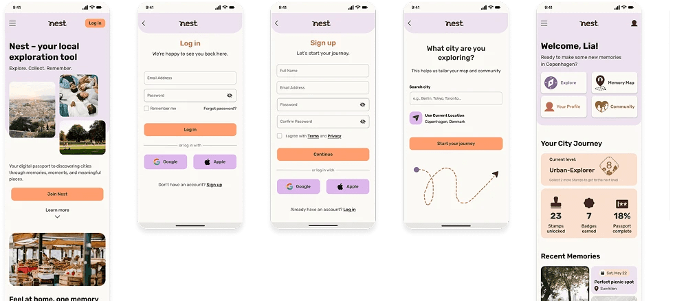
With the information architecture and key flows defined, I moved into wireframing to translate the concept into tangible interactions. The goal was to ensure that Nest feels intuitive, supportive, and emotionally aligned from the very first touchpoint.
To explore how Moov should work at a structural level, I started with low-fidelity sketches and wireframes. At this stage, I focused on testing key structural decisions such as:
Home feed vs search as separate entry points
Discovery of clubs, events, and training partners
Filtering by sport, level, and preferences
Detail pages that surface key information before joining
A clear but low-pressure path toward joining or finding a buddy
These wireframes helped define the core structure of the app and highlighted where users might need more clarity before committing.
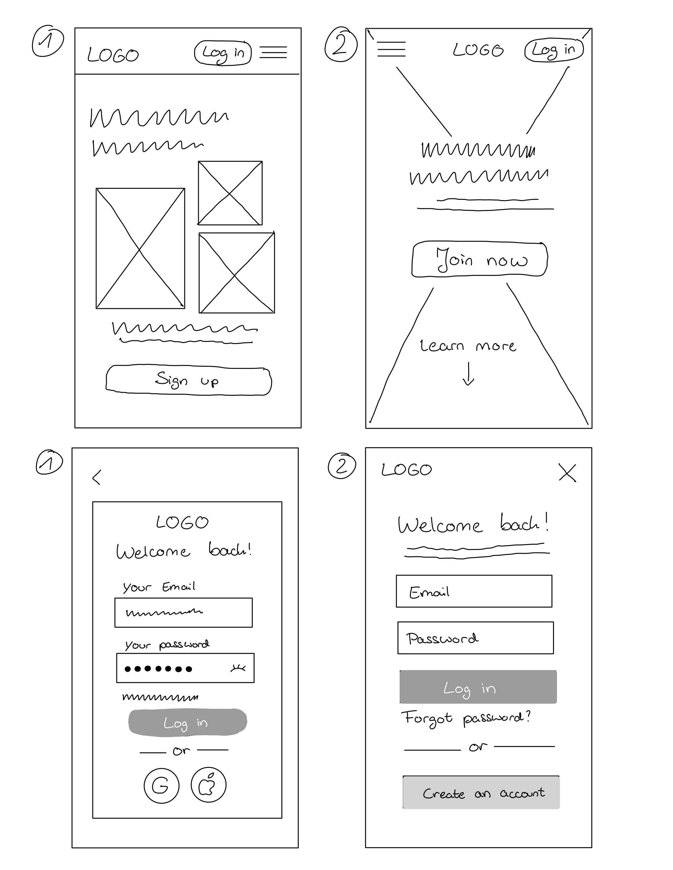
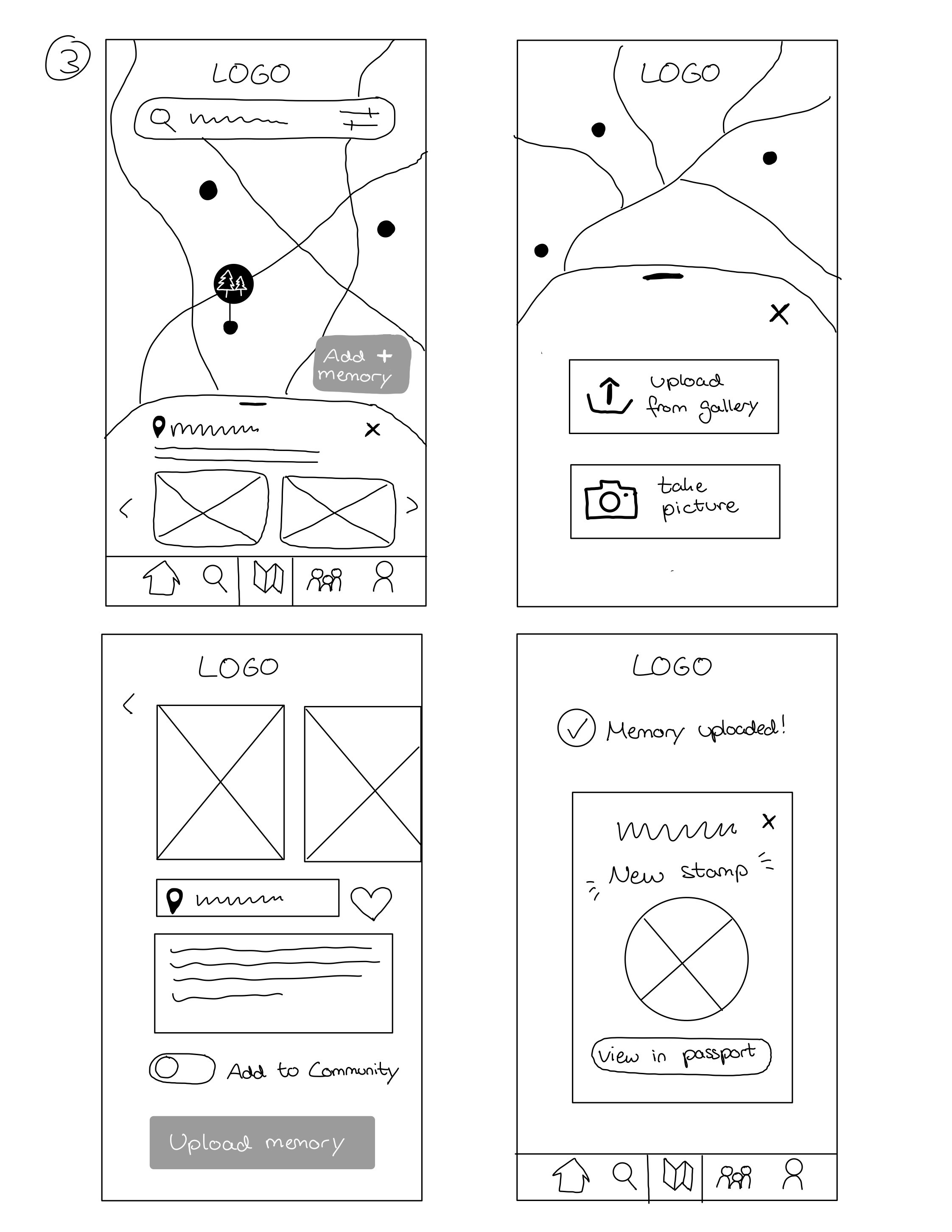
Low-Fidelity
Low-Fidelity
Low-Fidelity
I began by sketching the core flows I planned to test:
Log in
Landing page
Dashboard
Uploading a memory
At this stage, the focus was clarity over aesthetics. Sketching early allowed me to validate structure, navigation logic, and progression before investing in visual details. This ensured the experience felt natural and guided rather than overwhelming.
Mid-Fidelity
Mid-Fidelity
Mid-Fidelity
Once the structure was clear, I moved into Figma to refine layout, hierarchy, and interaction patterns.
Several key decisions shaped the experience:
Once the structure was clear, I moved into Figma to refine layout, hierarchy, and interaction patterns.
Several key decisions shaped the experience:
Homepage as Orientation Hub
Homepage as Orientation Hub
Designed to gently introduce key areas like Explore, Community, and Memory Map without cognitive overload.
Designed to gently introduce key areas like Explore, Community, and Memory Map without cognitive overload.
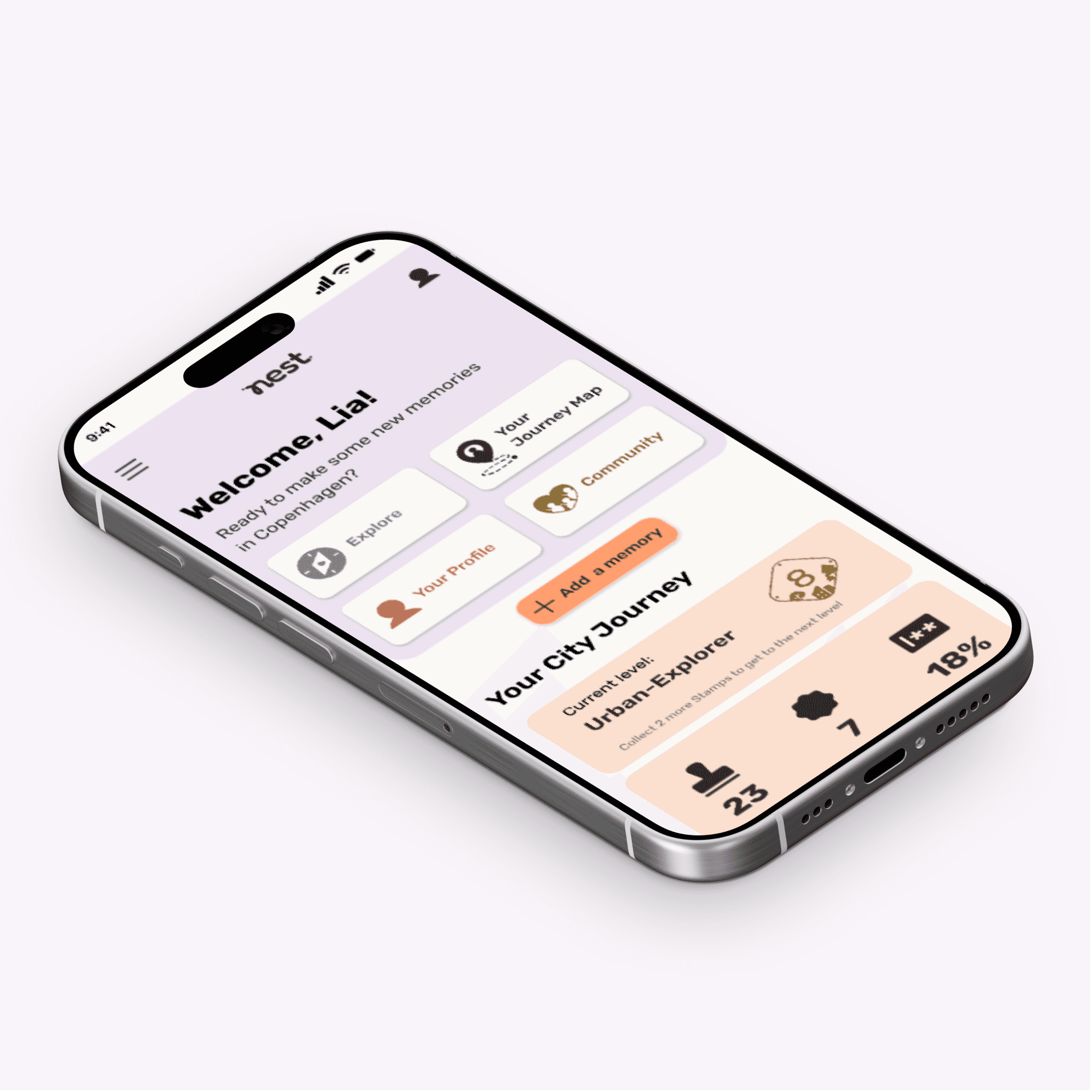
Dashboard as Motivation Engine
Dashboard as Motivation Engine
Displays earned stamps, levels, and recent memories to reinforce progress and make integration visible.
Displays earned stamps, levels, and recent memories to reinforce progress and make integration visible.
Calm Visual Structure
Calm Visual Structure
Whitespace, rounded shapes, and balanced pacing support the brand’s emotionally reassuring tone.
Whitespace, rounded shapes, and balanced pacing support the brand’s emotionally reassuring tone.
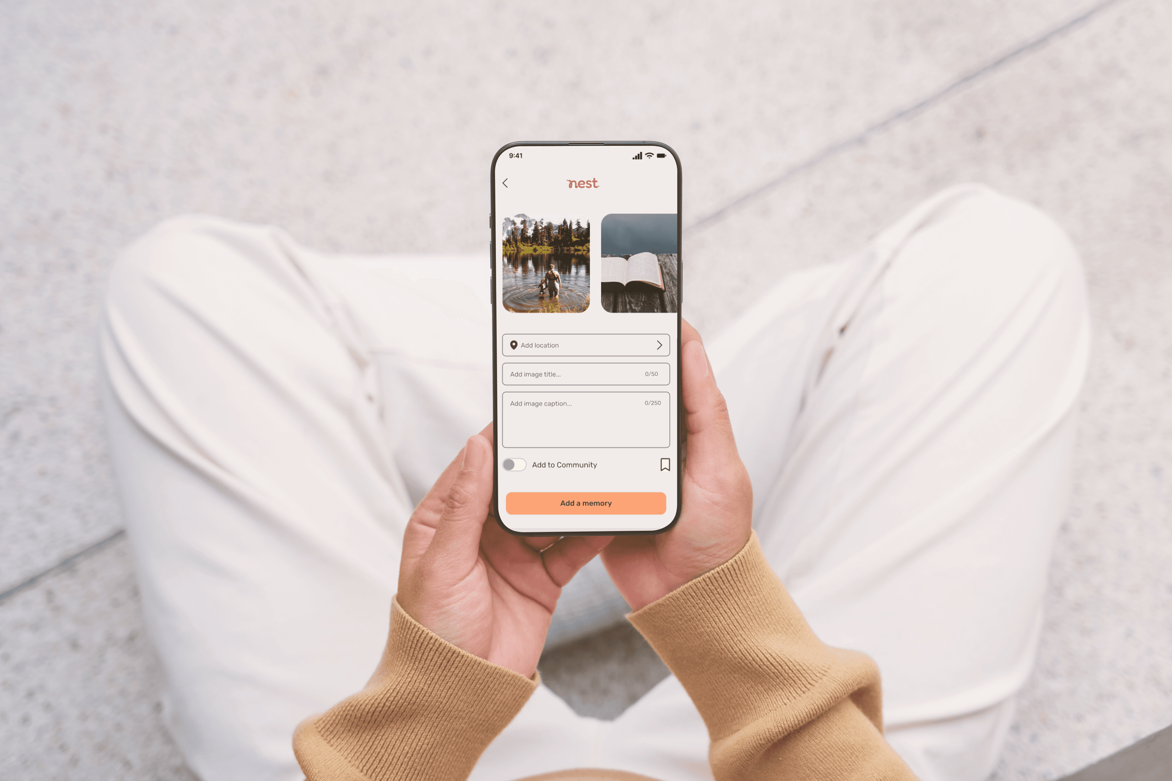
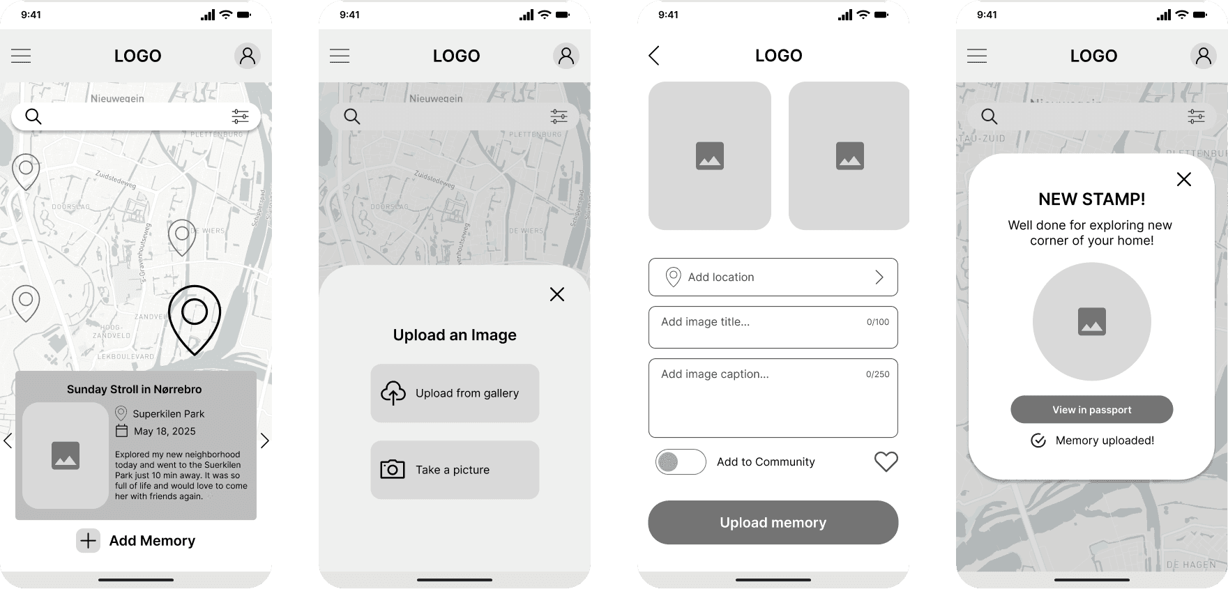
Simple Memory Flow
Simple Memory Flow
Uploading a memory is broken into clear, manageable steps. A confirmation screen reinforces emotional satisfaction and celebrates progress.
Uploading a memory is broken into clear, manageable steps. A confirmation screen reinforces emotional satisfaction and celebrates progress.
Consistent UI Patterns
Consistent UI Patterns
Familiar components and predictable navigation reduce friction and build comfort.
Familiar components and predictable navigation reduce friction and build comfort.

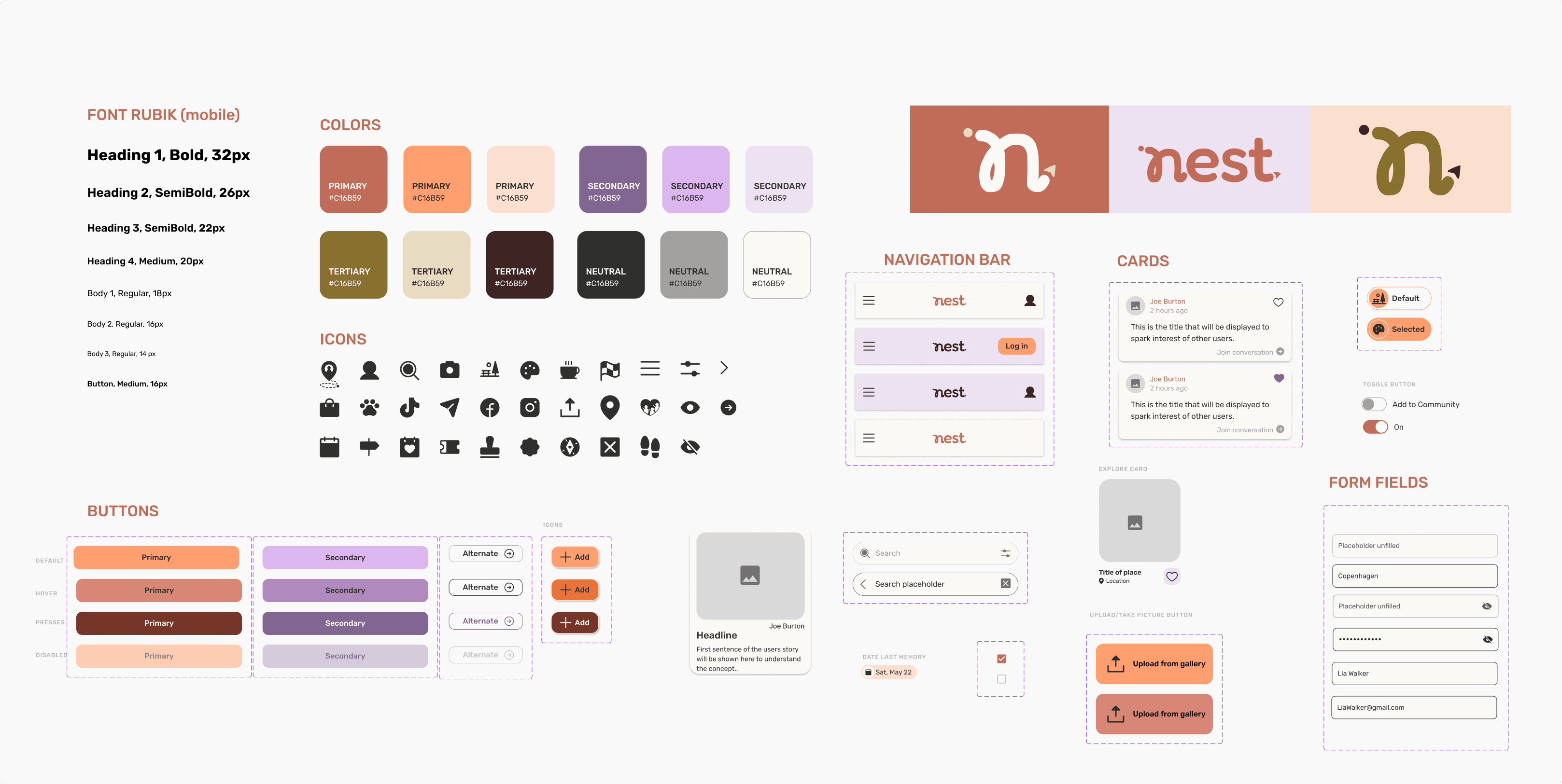
Designing a Calm and Personal Identity
To align the visual tone of Nest with its purpose I developed a brand identity rooted in the values of belonging, warmth, discovery, connection, and ease. I aimed to craft a visual language that feels personal, calming, and inviting.
Soft shapes and rounded elements to create warmth and approachability
Generous whitespace to reduce pressure and cognitive overload
A gentle color palette to communicate ease and subtle optimism
Clear typography and hierarchy to guide users confidently
Visible progress indicators to make small steps feel meaningful
The result is a visual language that mirrors the experience of building a nest over time, gradual, personal, and grounding.
With the structure in place, I explored a visual direction that reflects what Moov stands for: growth, inclusivity, connection, trust, and joy. The aim was to create an identity that feels energetic and social, without being intimidating.
The style guide defined the foundation for how the product looks and feels across screens.
A bold, friendly color palette that feels active and approachable
A clear typographic system to support hierarchy and readability
Consistent components for navigation, cards, and actions
Visual references that emphasize movement, community, and real-life activity
This system helped ensure consistency across the app and served as the basis for all high-fidelity designs.
High-Fidelity Exploration
High-Fidelity Exploration
High-Fidelity Exploration
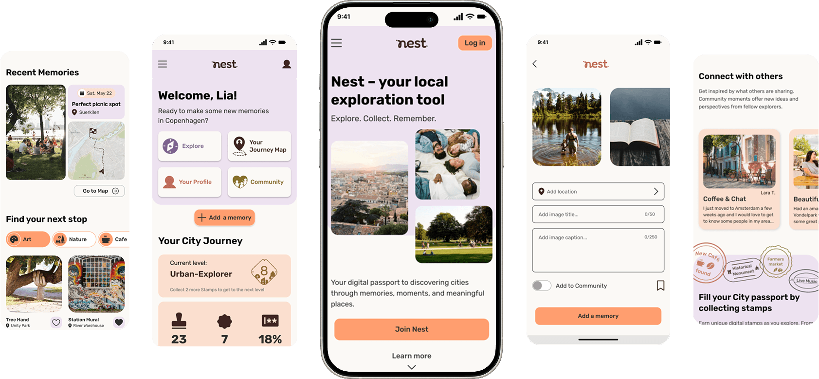
With the visual identity defined, I translated these principles into fully realized interface screens.
The final designs bring together structure, emotion, and interaction into a cohesive experience. Each screen balances clarity and warmth, ensuring users feel guided without being overwhelmed.
The focus remained on making exploration intuitive, progress visible, and small achievements meaningful.

High-Fidelity Testing
High-Fidelity Testing
High-Fidelity Testing
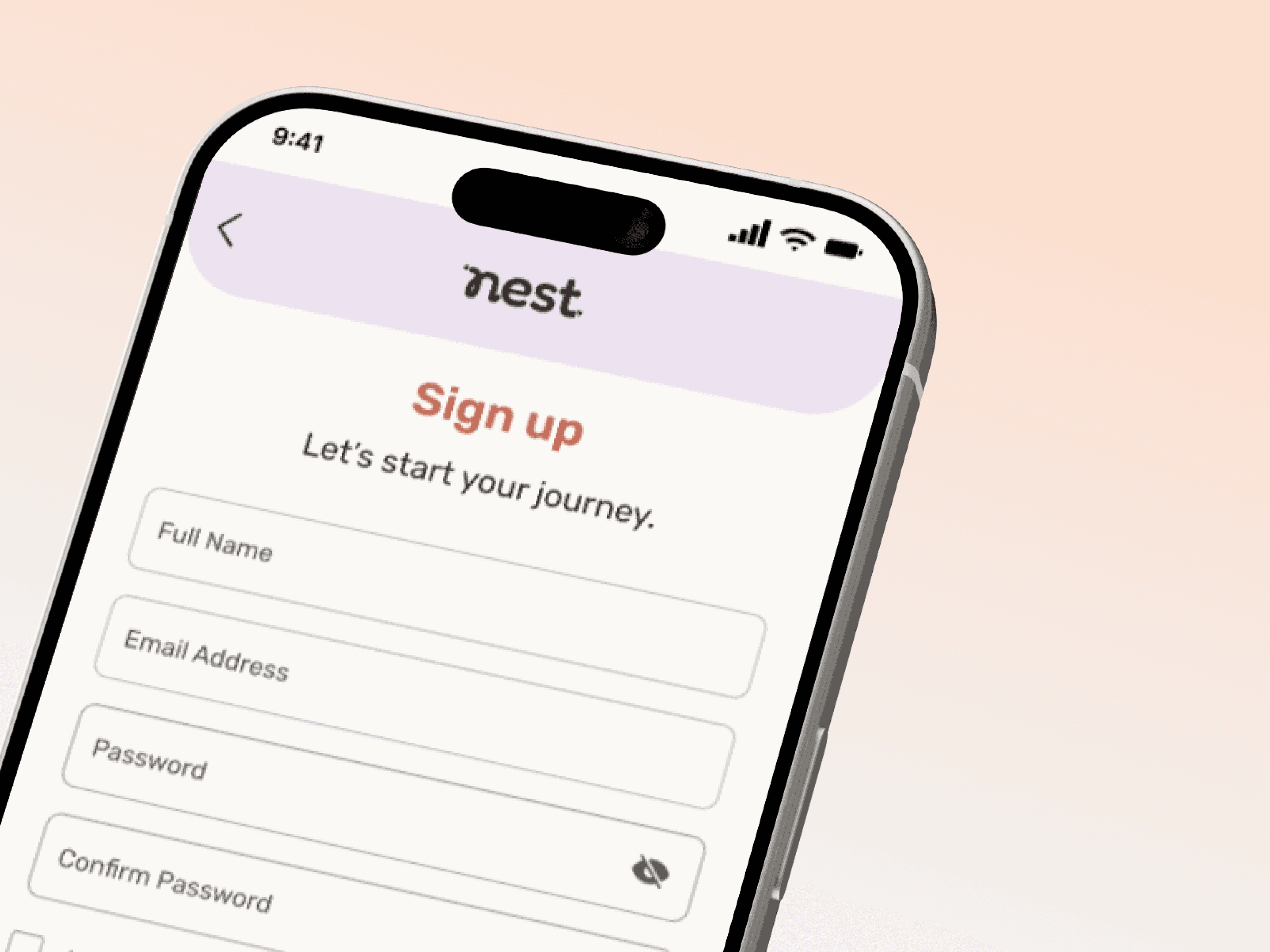
To validate the high-fidelity prototype, I conducted moderated usability tests with 5 participants aged 25–33. The sessions focused on two essential flows: signing up and uploading a memory. The objectives were to:
Ensure new users could navigate the product with ease
Test emotional clarity and satisfaction of interactions
Identify friction points in onboarding and memory upload
To validate the updated design, I ran a second round of moderated usability tests with five users. This round focused on the two core tasks:
Starting a planning group and inviting friends
Creating and interacting with a poll
What went well
What went well
What went well
All users successfully completed both tasks
The tone and reward system were positively received
The clean UI supported clarity and ease of use
What could be improved
What could be improved
What could be improved
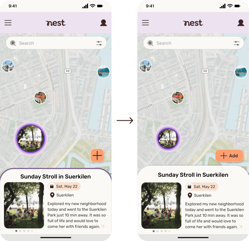
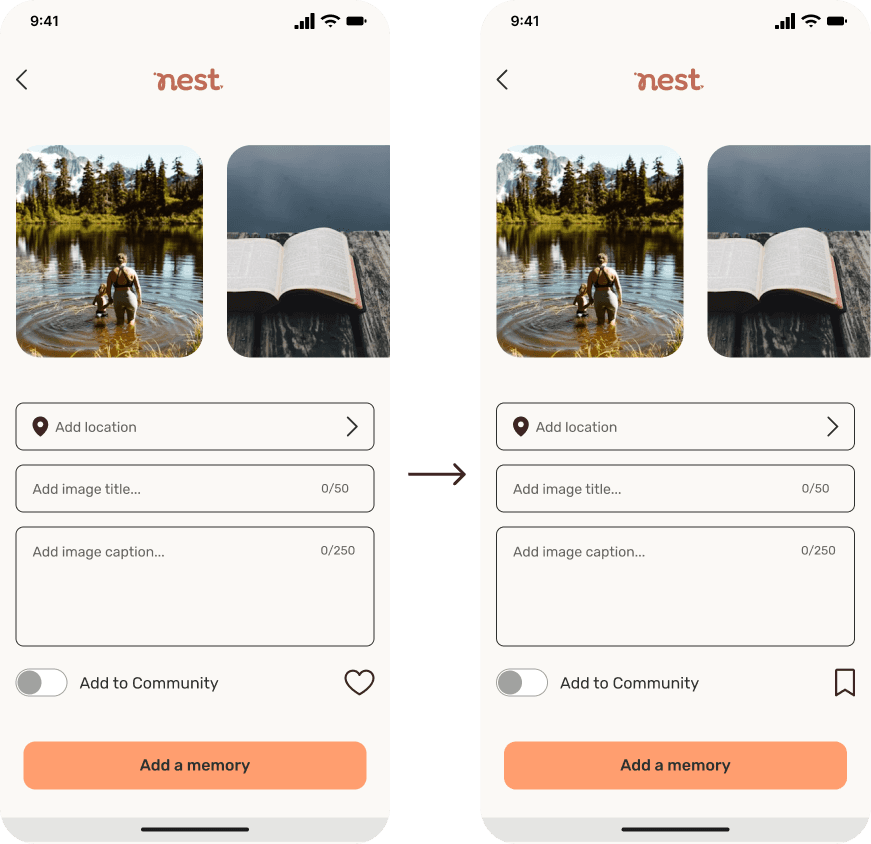
• The upload button on the map felt too subtle
• The “Use current location” button was often overlooked
• The heart icon resembled a “like” action
• The term “Memory Map” was not immediately intuitive
Key takeaway:
While users completed the core flows successfully, testing revealed opportunities to improve clarity in terminology and strengthen visual cues to reinforce confidence.
Iterations

ISSUE:
“Use current location” lacked visibility and clear affordance.
SOLUTION:
Moved it to the top
Strengthened button styling
Added clear divider between options

ISSUE:
“Memory Map” was unclear and users didn’t know where to add a memory.
SOLUTION:
Renamed to “Your Journey Map”
Added visible “Add memory” button
ISSUE:
Add (+) button blended into surrounding elements.
SOLUTION:
Added “Add” label
Increased shadow for visibility
Reduced competing visual elements

ISSUE:
User missed Type (Buddy, Club, Event) in Search Filter
SOLUTION:
Improved icon contrast
Added filtering
Enabled multi-image selection
ISSUE:
Heart icon caused confusion.
SOLUTION:
Replaced with bookmark icon
ISSUE:
“Use current location” lacked visibility and clear affordance.
SOLUTION:
Moved it to the top
Strengthened button styling
Added clear divider between options
ISSUE:
“Memory Map” was unclear and users didn’t know where to add a memory.
SOLUTION:
Renamed to “Your Journey Map”
Added visible “Add memory” button
ISSUE:
Add (+) button blended into surrounding elements.
SOLUTION:
Added “Add” label
Increased shadow for visibility
Reduced competing visual elements
ISSUE:
Low-contrast close icon and no filtering options.
SOLUTION:
Improved icon contrast
Added filtering
Enabled multi-image selection
ISSUE:
Heart icon caused confusion.
SOLUTION:
Replaced with bookmark icon
ISSUE:
“Use current location” lacked visibility and clear affordance.
SOLUTION:
Moved it to the top
Strengthened button styling
Added clear divider between options
ISSUE:
“Memory Map” was unclear and users didn’t know where to add a memory.
SOLUTION:
Renamed to “Your Journey Map”
Added visible “Add memory” button
ISSUE:
Add (+) button blended into surrounding elements.
SOLUTION:
Added “Add” label
Increased shadow for visibility
Reduced competing visual elements
ISSUE:
Heart icon caused confusion.
SOLUTION:
Replaced with bookmark icon
ISSUE:
Birthday entry is slow.
SOLUTION:
Improved icon contrast
Added filtering
Enabled multi-image selection
ISSUE:
“Use current location” lacked visibility and clear affordance.
SOLUTION:
Moved it to the top
Strengthened button styling
Added clear divider between options
ISSUE:
“Memory Map” was unclear and users didn’t know where to add a memory.
SOLUTION:
Renamed to “Your Journey Map”
Added visible “Add memory” button
ISSUE:
Add (+) button blended into surrounding elements.
SOLUTION:
Added “Add” label
Increased shadow for visibility
Reduced competing visual elements
ISSUE:
Heart icon caused confusion.
SOLUTION:
Replaced with bookmark icon
ISSUE:
Birthday entry is slow.
SOLUTION:
Improved icon contrast
Added filtering
Enabled multi-image selection
Final Outcome
Final Outcome
Final Outcome
Nest creates a more intentional way for newcomers to explore a new city by supporting emotional integration, not just logistical transition.
By encouraging small rituals, visible progress, and low-pressure connection, the experience helps people feel grounded, confident, and gradually at home in unfamiliar surroundings.
Reflections & Key Takeaways
Reflections & Key Takeaways
Reflections & Key Takeaways
Nest reinforced the importance of designing for emotional needs, not just functional ones. What began as a relocation concept evolved into a solution centered on integration and belonging.
This project strengthened my ability to translate research into clear product decisions and to shape an experience that feels both structured and supportive.
Key Learnings
• Emotional clarity is as important as usability
• Small interaction details significantly influence confidence
• Clear structure reduces overwhelm
• Iteration leads to sharper, more intentional design
Designing Nest deepened my understanding of how thoughtful UX can support people during moments of transition and uncertainty.
This project taught me how powerful it is to test early and design for different participation styles. Even low-fidelity prototypes revealed issues with navigation and feedback that I wouldn’t have caught from static screens alone.
Designing inside an existing system like Ticketmaster’s meant borrowing familiar components while still pushing for new behaviour – a balance between respecting constraints and advocating for user needs.
Let's create something extraordinary
Let's create something extraordinary
If you’d like to collaborate on a digital product, improve a feature, or bring a new idea to life, I’d love to chat.
